Here's a collection of illustrations that I've done most recently. All of them were created entirely in Adobe Photoshop and Illustrator, although mostly in Photoshop. I used to always use Illustrator to create my flat vector shapes, then I brought them into Photoshop to lay the gradients on top. I switched it up for some of these, however! I've started experimenting with more "paths" and "smart objects" in Photoshop, and found that I can get the same effect as I do in Illustrator! Yay for experimentation! As for the images themselves, the top image is of Stylish Stu, a chameleon in a poem I recently wrote. The bottom two elves were commissioned by a client as caricatures of his daughters. He used a fused image of them as his Christmas card this year. :) The next image is a whole bunch of cute aliens that I created for fun, and below that is (believe it or not) a self-portrait of me! (If you know me in person, the big hair and huge smile makes a whole lot of sense, haha!)
Designs by Tiffany Conklin
April 6, 2011
Posters, posters, posters!
Here's a smorgasbord of crazy posters I did for the Ringling College of Art + Design. My coworker and I decided that, as event hostesses, we should put our faces on our posters. What grew out of a simple idea is everything you see here... a goofy array of Photoshopped characters and bright eye-catching colors. Our programs were always widely-attended, so I guess the sillyness worked! :)
Company Branding Package
Here is a branding package I completed for Debt Solutions Made Easy, a local company. I started by designing their website, which underwent a few phases (top). The client eventually chose the second option from the top, with the bright blue header and footer. From there, I created letterhead, envelopes, and business cards for their employees. I also included various card designs and color options (bottom), however they really liked the original blue!
More event posters!
Saudi Aramco World
Here's a magazine spread I redesigned from an issue of Saudi Aramco World. Included is the magazine cover (top), and the article spread (6 following pages). I created this in Adobe InDesign. Also, please excuse the color variations in the background color. I lost the original file for this assignment and only have the PDF to view it now... it prints as one solid black color, but for some reason it varies from black to grey in the digital version? I originally figured out that it was an issue in my preferences... apparently "true black" is different than "black," but that saved version was one of the ones that was lost. C'est la vie!
Little Penguins
Cute Spot Illustrations! :D
U.S. Institute for Corporate Education
Here is a website I designed for U.S.I.C.E., a local online business institution. My first design (top) was by far my favorite, and the client really loved its curved menu bar. However, after some budget cuts, the client could not afford a website designer proficient enough to make this complicated design function on the World Wide Web. So, he asked lil' ol' me to try tossing it on the web myself! This was my first attempt at creating a full website, and after a few seminars, how-to books, and online tutorials, I was able to digitize it using Adobe Dreamweaver. However, the design was a little more than I could chew on comfortably, so I simplified the site layout (bottom). The institute's logo was never officially decided on before they had to close-up shop (thank you, recession), but I included some of my process work in the image. (middle)
Celebrity Business Cards
Movie Night!
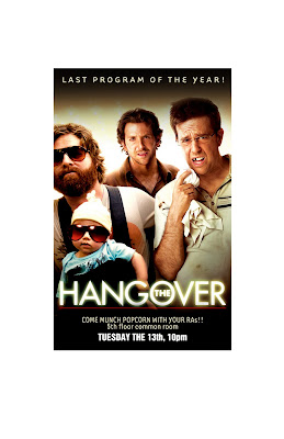
As part of my job at the Ringling College of Art + Design, I was faced with creating a poster package for a 70+ student event... We microwaved a boatload of popcorn, and projected The Hangover for a fun movie night. The original poster (top) was my main promotional poster. The other posters (condensed on the bottom) were randomized and hung on students' dorm doors to create hype about the event. They feature photographs of individual characters from the movie.
Experimenting in Adobe Illustrator
Here are a few of my little experiments in Adobe Illustrator. I created my own vector brushes to use for homemade fonts. These aren't complete font libraries, just fun words with fun shapes. Each letter in each word is made of the same vector shape as the rest of the letters in that word, only the brush is stretched differently over the shape of each letter. (Sorry if that's a little brain-busting!) I made a new brush for each word. It was cool experimenting with creating "images" through type!
Vectors... my favorite!!
Soap-On-A-Rope
Ok, this one is a little goofy... it was a gag gift for a friend, but I wanted to toss it up here anyway because it was a good attempt at package design. Because of the size of the paper I was working with, I had to divide the intended-box into two sections... the front/left/top panels and their tabs, and the right/back/bottom panels and their tabs. The light blue shape overlapping the left/front/right panels of the package was removed, and I pasted a piece of acetate in its place to serve as a "window" to view the enclosed soap-on-a-rope. I actually molded the soap, printed the packaging, and constructed the entire thing by hand, and it all functions very smoothly!
Floral Patterning
Here's one of my many attempts at floral patterning! I start out with a basic pattern tile (first/top image) and repeat it horizontally (second image) and then fill in extra pieces to make the pattern complete (third image). I tried it out on my business card (also third image), and experimented with the placement of the repeats (fourth/bottom image). Phew. I have real respect for whoever designs carpets and wallpaper!! What a tough job! Haha
Some new kids' stuff
Here's two pieces I did also using my standard combo of Adobe Illustrator and Photoshop. The top four images are a series of name tags for kids' school desks. If marketed, they would come in a variety pack, including an assortment of ladybugs, bumblebees, butterflies, and grasshoppers. The bottom image is a tribute to my friend Zack's dog, who passed over the summer. The illustration is of the two of them... meeting again. :) It was much more complicated to create than the name tags, but I also used many more tools in Adobe Photoshop. I used flat shapes, with gradients on top, and painted-sections and textures on top of that! Talk about some layers! :P
April 5, 2011
First post!!
Subscribe to:
Posts (Atom)